Tại bài viết này, IELTS CITY sẽ hướng dẫn chi tiết cách viết Pie chart IELTS Writing task 1 chi tiết từng bước kèm theo từ vựng, cấu trúc câu hữu ích và bài mẫu hay tham khảo.

1. Tổng quan về IELTS Writing Task 1 pie chart
Trong phần thi IELTS Writing Task 1, Pie chart (biểu đồ tròn) là một loại biểu đồ phổ biến mà thí sinh có thể gặp phải. Biểu đồ tròn được sử dụng để hiển thị sự phân bổ hoặc tỷ lệ phần trăm của các thành phần khác nhau trong một tổng thể. Mỗi phần này thường được biểu diễn bằng các màu sắc hoặc họa tiết khác nhau để phân biệt.
- các dạng (Thay đổi theo thời gian và không thay đổi theo thời gian)
Biểu đồ tròn được chia thành 2 dạng:
- Dạng biểu đồ động (dynamic chart): Thay đổi theo thời gian, mỗi biểu đồ trình bày thông tin của một năm/tháng và thường có nhiều biểu đồ.
- Dạng biểu đồ tĩnh (static chart): là biểu đồ tròn hiển thị dữ liệu tại một thời điểm cụ thể, không thay đổi theo thời gian. Có thể có một hoặc nhiều biểu đồ.
2. Cách viết IELTS Writing Task 1 pie chart
Bước 1: Phân tích đề bài
- Đọc kĩ đề để xác định biểu đồ tròn thể hiện điều gì.
- Chú ý đến các yếu tố như thời gian, đơn vị đo lường, và các thành phần chính trong biểu đồ.
- Xác định các đặc điểm nổi bật nhất, như phần nào chiếm tỷ lệ lớn nhất, phần nào ít nhất, hoặc có sự thay đổi lớn nào đáng chú ý.
- Dưới đây là tóm tắt lại những điều thí sinh cần lưu ý khi phân tích đề bài để chọn ra đặc điểm và xu hướng chính:
- tìm những sự thay đổi lớn (big changes) trong số liệu
- thành phần lớn nhất và nhỏ nhất (the highest and lowest points)
- sự tương đồng trong số liệu (any similarities)
- những số liệu không thay đổi (anything stayed the same)
Bước 2: Viết mở bài (Introduction)
Xác định 3 thành phần chính trong đề bài:
- Số liệu trong biểu đồ diễn đạt thông tin gì (What)
- Số liệu được lấy ở đâu (Where)
- Số liệu trong biểu đồ được lấy ở thời điểm nào (When)
Sau đó ta sẽ viết mở bài bằng cách paraphrase những thông tin trên.
Ví dụ:
Đề bài: The three pie charts below show the changes in annual spending by a
particular UK schools in 1981, 1991, and 2001.
What: the changes in annual spending by a particular UK school = the expenditure of a school
Where: UK school = school in the UK
When: in 1981, 1991, and 2001 = over a 20-year period
=> Mở bài (Introduction): The pie charts compare the expenditure of a school in the UK in three different years over a 20-year period.
Bước 3: Viết tóm tắt (Overview)
- Đối với biểu đồ động (dynamic chart)
Tìm 2 đặc điểm nổi bật:
- Xu hướng chính (main trend)
- Độ lớn (highest/lowest points)
- Đối với biểu đồ tĩnh (static chart)
- Tìm phần nào chiếm tỷ lệ lớn nhất, phần nào ít nhất.
Bước 4: Lựa chọn nhóm thông tin và viết Body 1 & 2
Khi viết thân bài cho biểu đồ tròn (pie chart) trong IELTS Writing Task 1, việc nhóm thông tin một cách logic và mạch lạc là rất quan trọng.
Những thông tin ở phần thân bài sẽ giống với overview nhưng được miêu tả chi tiết hơn. Thông thường ta sẽ nhóm những thành phần giống nhau chung một đoạn body (cùng tăng/giảm, cùng chiếm đa số/thiểu số)
3. Từ vựng và cấu trúc câu sử dụng trong pie chart
3.1 Từ vựng và cấu trúc miêu tả xu hướng ( dùng cho biểu đồ động)
Mô tả xu hướng tăng
Từ vựng cơ bản:
| Xu hướng | Động từ | Giới từ đi kèm | Danh từ | Giới từ đi kèm |
 | increaserisegrowgo up | toby (+ khoảng) | increaserisegrowthupward trend | toof (+khoảng) |
Từ vựng nâng cao:
Mô tả xu hướng giảm
Từ vựng cơ bản:
| Xu hướng | Động từ | Giới từ đi kèm | Danh từ | Giới từ đi kèm |
 | decreasedeclinefalldrop | toby (+ khoảng) | decreasedeclinefalldropdownward trend | toof (+khoảng) |
Từ vựng nâng cao:
Mô tả sự không thay đổi
| Xu hướng | Động từ | Giới từ đi kèm | Danh từ | Giới từ đi kèm |
| remain/stay stable remain/stay unchanged | at | stability | around ….between..and …. |
Mô tả sự dao động
| Xu hướng | Động từ | Giới từ đi kèm | Danh từ | Giới từ đi kèm |
| fluctuate | Around ….Between..and …. | fluctuation | around ….between..and …. |
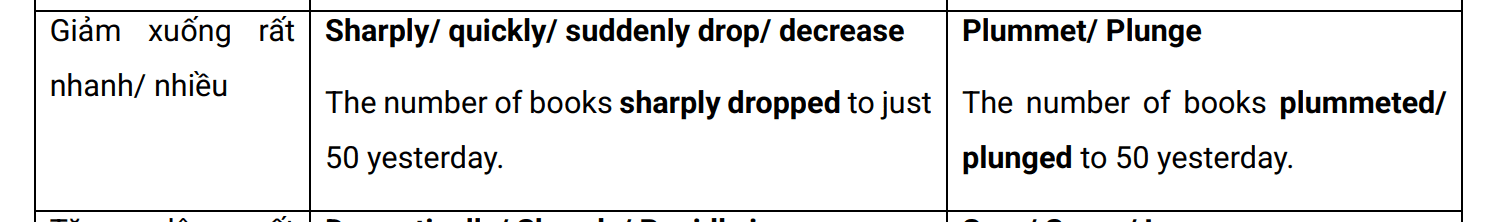
Mô tả tốc độ/ mức độ của sự thay đổi
CẤU TRÚC CÂU
Câu đơn:
| Đặc điểm | Cấu trúc | Ví dụ |
| Đối tượng được miêu tả là chủ ngữ | 1) Subject + Trend + Degree + Figure + Year. | The number of books at ABC Library increased dramatically to 2000 in 2022. |
| 2) Subject + Degree + Trend + Figure + Year. Trend là danh từ, nên câu văn thiếu động từ số động từ có thể sử dụng: experience, see, witness, record, register | In 2022, the number of books at ABC Library witnessed a dramatic increase to 2000. | |
| Chủ ngữ là xu hướng | 3) Degree + Trend + Figure + Subject + Year. | A dramatic increase to 2000 was experienced in the number of books at ABC Library in 2022. |
| Chủ ngữ là thời gian | 4) Year + Degree + Trend + Figure + Subject. | (The year) 2022 witnessed a dramatic increase to 2000 in the number of books at ABC Library. |
| Sử dụng chủ ngữ giả | 5) There + be + Degree + Trend + Figure + Subject + Year. | There was a dramatic increase to 2000 in the number of books at ABC Library in 2022. |
3.2 Từ vựng và cấu trúc để miêu tả phần trăm và so sánh:
A. Giới thiệu sự khác biệt: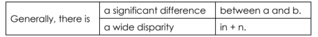
B. So sánh hơn/kém:
C. So sánh nhất
D. Miêu tả phần trăm
4. Các lỗi thường mắc phải khi viết pie chart
- Sử dụng thì quá khứ khi cần dùng thì tương lai.
Giải pháp:
Vì việc có một biểu đồ với dữ liệu dự đoán trong tương lai không phổ biến nên các ứng viên thường sử dụng thì không chính xác. Nếu biểu đồ tròn có thời gian trong tương lai (sau thời điểm viết) thì ta sẽ cần sử dụng các biểu mẫu trong tương lai để tóm tắt dữ liệu.
Ví dụ: In 2050, it is predicted that 15% of students will study Art and Design.
- Sử dụng thì quá khứ khi biểu đồ không đề cập đến thời gian cụ thể. Trong trường hợp này ta sẽ sử dụng thì hiện tại đơn.
- Miêu tả số liệu chi tiết trong phần tổng quan
Giải pháp:
Ta không cần phải đưa các sự kiện và số liệu vào phần tổng quan (overview). Thay vào đó, ta nên sử dụng mô tả chung về những số liệu đáng chú ý nhất (sự khác biệt lớn nhất/nhỏ nhất/lớn nhất) và lưu lại chi tiết cho các đoạn thân bài.
5. Bài mẫu IELTS Writing Task 1 pie chart
5.1. Bài mẫu dạng có thay đổi theo thời gian
The charts below show the results of a questionnaire that asked visitors to the Parkway Hotel how they rated the hotel’s customer service. The same questionnaire was given to 100 guests in the years 2005 and 2010.

The pie charts compare visitors’ responses to a survey about customer service at the Parkway Hotel in 2005 and in 2010.
It is clear that overall customer satisfaction increased considerably from 2005 to 2010. While most hotel guests rated customer service as satisfactory or poor in 2005, a clear majority described the hotel’s service as good or excellent in 2010.
Looking at the positive responses first, in 2005 only 5% of the hotel’s visitors rated its customer service as excellent, but this figure rose to 28% in 2010. Furthermore, while only 14% of guests described customer service in the hotel as good in 2005, almost three times as many people gave this rating five years later.
With regard to negative feedback, the proportion of guests who considered the hotel’s customer service to be poor fell from 21% in 2005 to only 12% in 2010. Similarly, the proportion of people who thought customer service was very poor dropped from 15% to only
4% over the 5-year period. Finally, a fall in the number of ‘satisfactory’ ratings in 2010 reflects the fact that more people gave positive responses to the survey in that year.
(extracted from IELTS Simon)
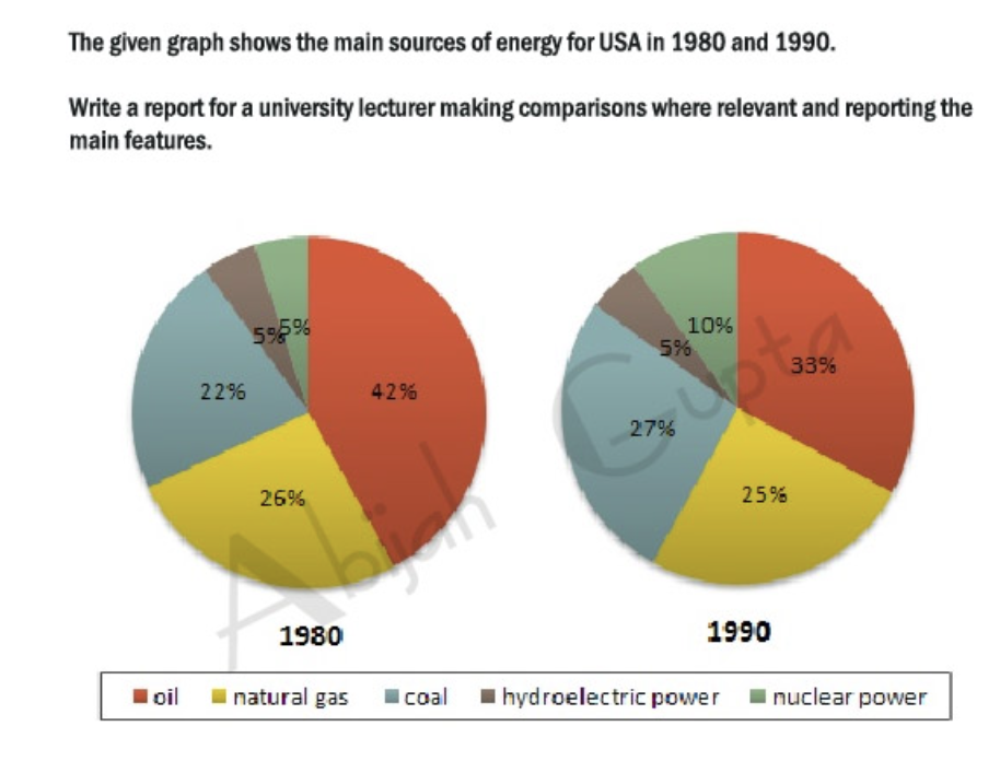
The pie charts illustrate the changes in energy production from five different sources (oil, natural gas, coal, hydroelectric power and nuclear power) for the USA in two years (1980 and 1990).
Overall, oil constituted the main source of energy production in both years, while hydroelectric power produced the least energy. There was a slight decrease in production from oil and natural gas, whereas an increase can be seen in the figures for coal and nuclear power.
The amount of energy produced by oil in the USA accounted for 42% in 1980 and this, then, fell to a third (33%) in 1990. The proportion of energy from hydroelectric power, on the other hand, remained constant in both years at a mere 5%.
The energy generated by natural gas, which was the second largest source of
energy in the USA in 1980, fell by 1% to a quarter of all energy produced in
1990. In contrast, production by coal increased from 22% to 27% in 1990 while there was a 5% rise in energy from nuclear power to reach 10% in the second year.
(extracted from IELTS Liz)
5.2. Bài mẫu dạng không thay đổi theo thời gian
The pie charts below compare water usage in San Diego, California and the rest of the world.
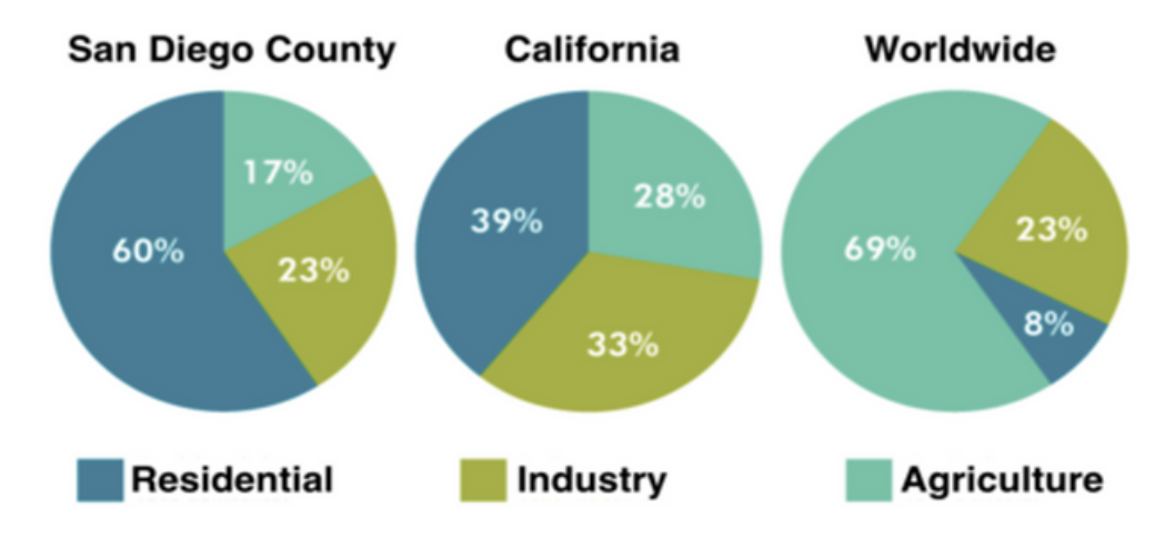
The pie charts give information about the water used for residential, industrial and agricultural purposes in San Diego County, California, and the world as a whole.
It is noticeable that more water is consumed by homes than by industry or agriculture in the two American regions. By contrast, agriculture accounts for the vast majority of water used worldwide.
In San Diego County and California State, residential water consumption accounts for 60% and 39% of total water usage. By contrast, a mere 8% of the water used globally goes to homes. The opposite trend can be seen when we look at water consumption for agriculture. This accounts for a massive 69% of global water use, but only 17% and 28% of water usage in San Diego and California respectively.
Such dramatic differences are not seen when we compare the figures for industrial water use. The same proportion of water (23%) is used by industry in San Diego and worldwide, while the figure for California is 10% higher, at 33%.
(extracted from IELTS Simon)
The pie charts give information about the world’s forest in five different regions.
Summarize the information by selecting and reporting the main features, and make comparisons where relevant.
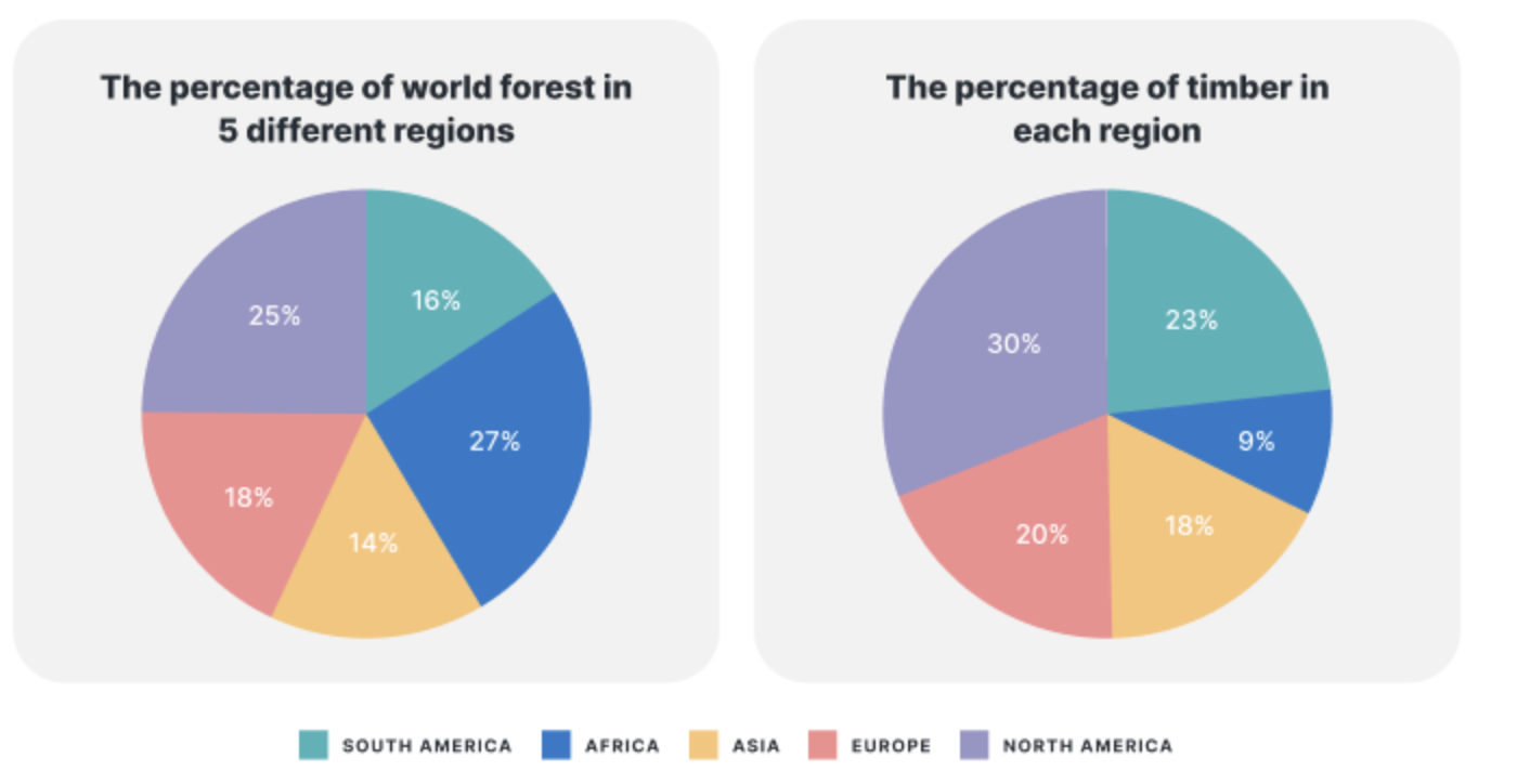
The pie charts give information about the world’s forests and timber according to continent.
Looking from an overall perspective, it is readily apparent that most of the world’s forests are in Africa and North America, followed by Europe, South America, and lastly Asia. In contrast, Africa possesses the least timber while North America has the most.
Looking first of all at North America and Africa, the former continent represents 25% of the world’s forest and the latter 27%. In terms of timber, the figure is slightly higher for North America (30%) and drastically lower for Africa (9%).
Forest and timber ratios are more even in the other regions. European nations contain 18% of the world’s forests and 20% of its timber. South America is marginally lower at 16% for forests and moderately higher at 23% for timber. Finally, Asian forests constitute 14% of the global total and 18% of all timber.
(adapted from How to do IELTS)
6. Cập nhật đề Pie chart mới nhất tháng 10.2025
Ngày 26.10.2025
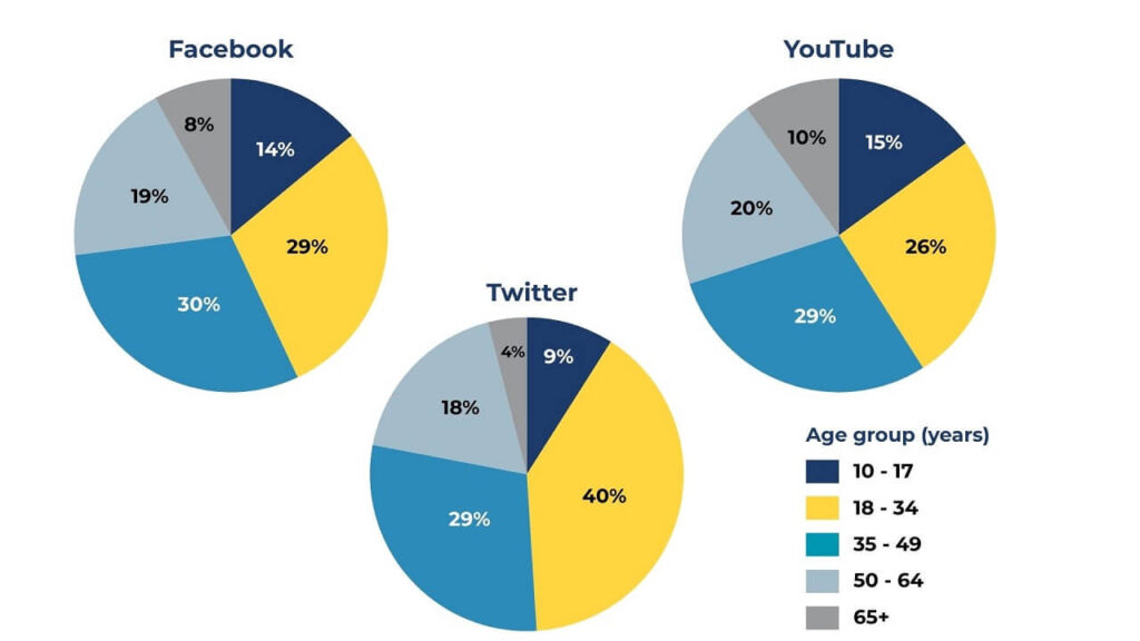
Task 1: The pie charts show the proportion of users across different age groups on three apps:Twitter, Facebook and YouTube. Summarise the information by selecting and reporting the main features, and make comparisons where relevant.
Tham khảo: Bài mẫu đề thi IELTS Writing Task 1 dạng Pie chart ngày 26.10.2025
Ngày 17.10.2025
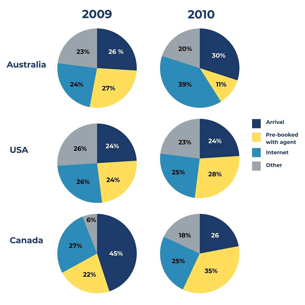
The pie charts below show the methods used by international students when booking online English courses in three different countries in 2009 and 2010. Summarise the information by selecting and reporting the main features, and make comparisons where relevant.
Tham khảo: Bài mẫu đề thi IELTS Writing Task 1 dạng Pie chart ngày 17.10.2025
Cập nhật đề thi và bài mẫu mới nhất tại:
Tại bài viết trên, IELTS CITY đã hướng dẫn các bạn chi tiết cách viết Pie Chart IELTS Writing task 1 chi tiết từng bước, từ vựng và cấu trúc câu phù hợp. Hy vọng sau bài viết này, các bạn có thể tự tin hơn để xử lý dạng bài Pie chart trong IELTS Writing task 1 nhé. Chúc các bạn luyện writing hiệu quả và sớm đạt Target!
Bài hướng dẫn cách viết các dạng khác: